Showing posts with label Film Poster. Show all posts

Tuesday, 17 January 2017

Peer Feedback Response of My Film Poster

I asked a couple of students within my media class  to see their opinion on my film poster as having feedback other than yourself is very important. As not everything I like, others will also like. 

How effective do you think the film poster is overall?
-One student said yes it is effective
-One student said ' It looks gloomy and barren which definitely adds to the tone of your film, it hints towards what it will be about'.
- 'I think it works well as the colour scheme and house style matches the film itself'
Is the picture appropriate for my short film?
-'It shows the protagonist as the remaining character'
-'Fitting for a post-apocalyptic film'
-It is appropriate for my short film
Is the style of my poster appropriate for my short film?
-The style is appropriate for my short film
-'Yes, the location looks quite vast and empty which makes the character isolated and lonely'.
-'It is appropriate
Do you think the poster looks like a legitimate film poster?
-It does look like a legitimate film poster
-'Yes I like the faded effect'
-Yes I like the typeface choice'
Would you change anything on the poster? If so what?
-'Maybe make the character a little more prominent so that the audience can engage with him a bit more'.
-No
-'No, I like the poster as it stands'.
Examples of my responses:

In conclusion, I think the response was very positive. Even though I only questioned a few people I still think it is very helpful. Most of the feedback was extremely positive and there was only one improvement suggested. They said it looks like a legitimate poster and it fits the style and genre of my short film. The only improvement suggested was to make my protagonist larger which I completely agree as he should take up more of the poster. However, I am going to keep it as it is as I am satisfied with it to an extent myself and so are my responses as a whole.

Sunday, 15 January 2017

Film Poster Photoshop

After taking the images I then came to the decision of this one as I think it looked great. I made the photoshop canvass size to a typical film poster of 27'' x 47''. I then dragged the image and sized it to the position I wanted it to be. I felt like that the image was too bright. Therefore, I used the 'Hue and Saturation' effect and made the image darker. Moreover, I still felt like the image was too bright and colourful, so I added the 'Black and White' effect and made it black and white but lowered the opacity on it so it wasn't completely black and white but still made it darker.
I then added some dirt particles to the layer and lowered the opacity on this, to make the poster look old and an abandoned feel towards it. Following this I also added an old piece of paper texture which I got off google. This made it look great and I love the outcome of it.

 
Then, I added the text, which was the typeface 'Porter' from my font post. I felt like the text was great as it stands out a lot but needed some character. Therefore, I googled a paint brush texture and placed it above. Then I made this layer have a clipping mask, which adds this layer within the text. I lowered the opacity and increased the levels to make it seem like it had more particles. I think the outcome was great shown below.

I did the same effect with the cast below. I used the 'Will&Grace' font for this. It looks great and really professional. These were all the people involved within my short film.
This is what the final product looks like. I added the billing block at the bottom which I got off google. Then above I added 'coming soon' and 'In 3D', using the same font as the title, to keep it simple. For these texts I used another style to make them look old. I used the 'distorted' effect and made it look like it had particles.
I really like what my film poster turned out like. It has a very old feel about it which is what I was hoping. I think it fits the genre well and the plot. Also from doing research, I followed many of the same traits than other film posters within the post-apocalyptic genre. Knowing this, I know the audience of this genre will acknowledge my poster and it should appeal to them.

Finding The Correct Typeface

I decided to look for suitable fonts and then analyse the benefits or disadvantages of each one to see which ones are most proficient to use. 
Futura looks great, it is a very large font that stands out well meaning it is perfect for a poster - especially for a title. It is long and has character which I love about it. I may use this for my film poster.

This font is very similar to 'Futura' in fact. It is just less long and more chunkier.  This would also look great as a title text or something that needs to be large. It is more curved and has a happier feel towards it which is not what I am wanting however. So I do not think I am going to use this.
I love these fonts. They are both very similar and I think they both have real potential for my main title. They are both bold, sleek, simple and perfect for a title. You can clearly comprehend them quickly and from a distance which is very important. I am considering these highly for a candidate for the title font.
Like the fonts name 'Futurist' It has a very futuristic feel towards it. This is not what we want however I feel like it would be great to use for an actor font at the top. The font being spaced out from each other makes the font look very lonely which could emphasize the story of the protagonist being very lonely.
Will&Grace would be a great font for the cast or the tagline. It is not bold enough therefore it is not what I'm looking for, for a title. However I feel like I could definitely use this elsewhere for a subordinate feature. 
This font has a lot of character with pointed serifs. It is great being bold and thick which Is why I choose it but the font looks angry which is not the sort of feel I want from a font on my film poster.

In conclusion, I think 'Porter' would look great for a main title as it is so simple, bold and easy to read. All traits you need for a title. Moreover, 'Will&Grace' would be great for a subordinate font as it looks smart and professional and again easy to comprehend. It fits my genre well. I am only going to use two fonts as I do not want my film poster to be too complicated.

Saturday, 14 January 2017

The Chosen Image

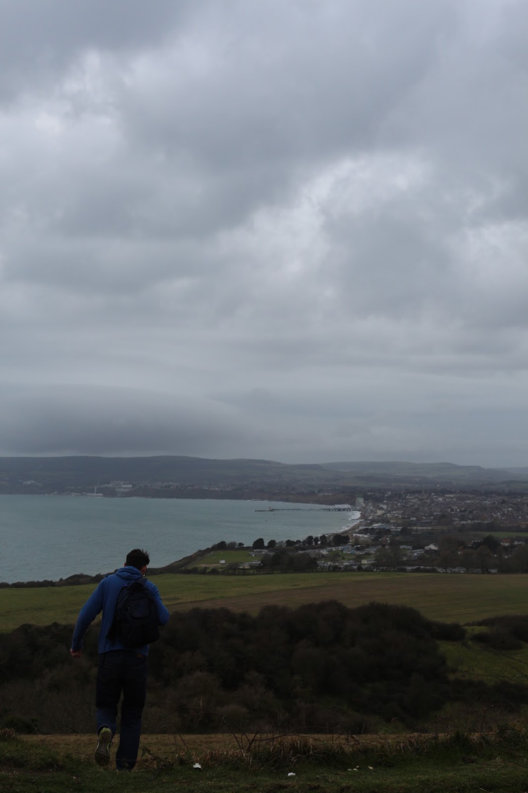
This is my chosen image that I have decided to be for my film poster. I like it firstly that there is a lot of sky at the top so I can place the title there without interfering with anything below and it will make the title stand out more. The sky looks very dark and grey which is perfect as it adds the setting even more. I want the poster to have a dark feel about it so this was perfect. The protagonist in the photo also looks a lot more genuine compared to most of my other pictures that I took. He looks like he is walking, searching for someone or something. This fits the story line better and also looks more natural than him standing still or posing for an image. The scenery is great, I took advantage of the great views that I live on. The island looks great in the background. There is no boats or people anywhere to be scene so it is perfect as in my short film there is meant to be very limited population. The colours are quite bright, however I can change this in editing. 

Tuesday, 10 January 2017

Film Poster Images


The Bridge
I think these shots look great, the bridge looks overgrown and abandoned which links to my genre. One of the shots look like he is looking for something, a community perhaps. Which correlates to the short film as he is in search for someone or a community. These are great photos however they will be hard to make a good film poster therefore I am not sure I can use these. The overall mis en scene is great and the setting fits perfectly but I think I prefer my other photographs.


The island and grassland shots
I went to a place near my house and took advantage of the scenery around me. I picked a day where the weather was not very pleasant and it was perfect. The clouds were dark and grey and gives a more depressing and dark feel towards the poster. He is also wearing clothing that he did in the short film which makes it more realistic. In these images he is also carrying a bag so incase he finds any houses with loot in, he can put them in his bag which gives the image more of a story. I like the range of photos that I took as it gives me a lot of choice. I took scenes showing the back of him and also the front which is used continually with post-apocalyptic posters. Some of the photographs seems like he is posing for the image which is not what I want. The other images are him walking so it looks real and genuine which is a lot better. I am going to choose one of those images. I think I prefer the images of him facing with his back to the lonely and bare island/sea.

Monday, 9 January 2017

Film Poster Flatplan


I do not want my film poster to be too complicated. I have decided to keep it very simplistic and not too harsh on the eyes. I want to deliver a simple message that describes the movie itself easily and also teases them enough to want to watch the film as well.

Moreover, I have not made all my features that are recognisable to the audience and I have also placed all the features that I have used in all places that are usually seen. Reasons for this is that I want the audience to feel the poster is recognisable as possible and nothing is outlandish.

Keeping it simple also emphasizes the loneliness of the character within the poster. As he is mainly by himself in the post-apocalyptic world, this poster due to lack of fullness, will also suggest it.

Sunday, 8 January 2017

Thinking About My Film Poster

From doing research I have came to the conclusion on the features that is going on my film poster and also what the main image is consisting of.
I think I have decided that the protagonist is going to be a front shot or back shot, if it is a front show he will be very emotional as he is so alone. I have decided the background will be one of my locations on the film, the abandoned holiday park called Atherfield bay holiday camp. This will show how abandoned his surrounding has became and ruined due to the carnage of the disaster.
From research of others, I think the tagline will be best at the top as this is where you generically see them and the audience are aware of it.
The billing block and partnerships will be at the bottom, from all the posters I have seen it is like this also. Therefore mine will follow the same traits.
Moreover, depending on the position of the protagonist in the image, The title will either be in the middle or above the billing block. This is where you are focused the most and knowing the title of the film is very important to know what poster for which film you are looking at.

Friday, 6 January 2017

Other Film Poster's Analysis


127 HOURS
They have gone for a very simple approach for their film poster as this certain image is very well known as it is the rock that trapped him for so long. There is literally no other information on the film poster other than the billing block. The audience acknowledge what the poster means after seeing the trailer so this simple poster would remind them that the film is coming out.

TIN TIN
They have used Steven Spielberg and Peter Jackson as a big selling point for the poster, having their names with quite large text at the top. They intend to do this as they are popular and known for there work so they have promoted this as a big selling point for them self. Another selling point they have made clear, putting it in yellow font, is saying that it will also be in 3D. There is a big fan base for 3D so knowing the audience that it is also shown in 3D will appeal to many - one of the reasons they have decided to add that to the poster. Partnerships are also clearly shown at the bottom and also coming soon. People like to know what companies have worked on the film as they have certain taste for certain companies and they also like to know when it is released roughly so putting 'coming soon' keeps them intrigued and teased as they are not getting an exact date. Moreover, the title is very clear and easy to comprehend from distance.The film poster shows a lot, it shows the two main casts walking on a globe then a plane and a ship by each side. This suggests the adventures they are going on and that the film as a whole is eventful.

AVATAR
Avatar has gone for floating heads over the scene approach to its poster. They chose the two protagonists overlapping each other which normally signifies love and the film will be soft and touching, which the film is. The back drop is very exiting, it is them flying one of the animals which is one of the best moments in the film. The scenery is beautiful and looks amazing on the film poster. They put Avatar in large blue text, there font is very distinctive and it is now associated with Avatar so the audience are used to seeing it. At the top it states that the director has also made the films Terminator 2 and Titanic - both very popular films. This will give the audience a picture that these films are great and have been successful so this film should also be to high standard. It will make them more interested to watch the film even more. At the bottom in large, bold and white text so it stands out, they have said that it is shown also in IMAX 3D which will intrigue a lot of people as not many films show in this way.


Knowing the similarities narrows down the key points in which gives me acknowledgement of the main and important features to include in my own product.
Similarities
There are many similarities between the posters. Firstly, Avatar and 127 Hours both have a billing block same position and practically same exact layout. This is due to the audience are familiar with this position and how it is set out so films generally tend to follow the generic traits. In all 3 film posters, they all clearly show the partnership companies. This seems like an important feature to include. In Avatar and Tin Tin the title is both in bold font and shown in the middle lower section of the film poster. The billing block and release date are always below. In both again, right at the top are the main important people who have worked on the film, being the directors or actors.

Wednesday, 4 January 2017

Post-Apocalyptic Fiction Film Poster Analysis 3


Title
This is the first title that is a different typeface style that I have analysed. This title is a very large and bold font that stands out extremely on the film poster. The yellow stands out very well on the blue background being the sky. Instead of just having yellow font, they added a old texture which makes it look very creative and interesting. It takes up most of the upper part of the poster so its very easy to see and being bold text it is quick to comprehend. You can defiantly see this text from far away, which is great for posters.
Release date
This poster has the release date which in fact, my other two posters did not include. They have kept the same colour scheme as the main title so there is not too much going on. Knowing the release date lets the audience know when to expect the film and when they can watch it. It will keep them interested until the point of release. Moreover, below says you can see in both 2D and 3D. Knowing this will attract a larger audience, especially those who love 3D and it will get them very excited.
Tagline
'What a lovely day' is the tagline at the top of the film poster just above the title. This is a quote from one of the characters within the film. You hear this in the trailer so they are aware of what it means.
Billing Block
This is different from my other two posters as this poster does not have a billing block. Instead there is just the partnerships of companies they worked with. They kept the film poster very simple as they did not want to over complicate it. Just enough to tease the audience. 
Main image
The main image is again consisting of the protagonist facing backwards. It seems very popular within a post-apocalyptic film poster. He is looking off in the distance with a old and ruined vehicle by the side  to him. The setting looks very plain and abandoned showing how derelict the surrounding is that he is in. Being such a simple main image with not a lot of story interests us to find out what it is all about.
Lighting and colours
Rather than having extremely dark colours such as my other two posters I have analysed, this one uses more brighter colours. The main two colours here are blue and yellow. These are the two colours of the terrain, yellow being the sand and blue being the sky. It is very different to other post-apocalpytic films which could be the reason for its great success.

Monday, 2 January 2017

Post-Apocalyptic Fiction Film Poster Analysis 2

Title
The typeface is actually very similar to the first poster I analysed, 'The road'. It seems to be a trend to use this font for post-apocalyptic posters. I may have to consider using this for my own poster as it is the same genre. For I Am Legend's title it has more characteristics about it however. This title has more spacing between each letter which makes it more unique and distinctive. Also, instead of it being in one line or two, it is divided into 3 lines piled on top which makes it look very interesting. Lastly, like most posters, the title stands out extremely well. It is a gold font against a black background which makes it very easy and clear to read. Gold and black are usually assocated with each other as they are liked mixed colours together. 
Tagline
The tagline, 'The last man on earth is not alone', gives a lot away already. It spoils the audience already which I am not sure I like. Rather than it teasing us, it gives the information straight away. However, I suppose it does also make people want to find out who he meets and why they are not in the poster also. 
Billing Block
The billing block is similar to the last poster I anaylised. They typically always look the same and use a colour that stands out on the background. Within a billing block is the credits that all worked on the film. It is useful to see who has worked on it and they use this as a selling point, such as placing Warner Brothers in the billing block.
Main image
The main image is himself facing forwards rather than backwards, which was in my last poster analysis. It looks like these are the two main conventions of a post-apocalyptic poster, the protagonist facing frontwards or backwards. He has a very serious emotion on his face which gives the audience an impression that it is a serious film. Moreover, there are various buildings behind him, looking like he is in a city. Normally cities are full with life however the buildings behind him look abandoned and derelict. This makes the audience intrigued and wanting to watch the film to see what happened. He is also holding weapons which makes us think that he is in danger and makes the audience know why is he in danger and who from. Cars are destroyed, banners are ripped and wildlife is over grown. So we know it has been a while since human kind has mainly left.
Lighting and colours
The lighting is very dark and has no brightness towards the poster. This seemed to be very similar than the previous poster. The color is either black and orange and other than this there is no other colours. This is again similar to my other poster however it was black and gold, very similar colours. Having no colours shows that it is a very dark and serious film. He is also not wearing any clothing that is colourful, which extends the theory even more.

Sunday, 1 January 2017

Post-Apocalyptic Fiction Film Poster Analysis 1

Title
The title stands out very effectively. It is practically centered in the middle so it catches your eye almost immediately. Also it being a light text against a very black background also adds to its easiness to read it clearly. This is needed as it is not a bold or thick font so these other elements help it to stand out. The text is old fashioned and looks very slick. I think it works great with the whole theme of the movie. The road could be suggesting that there is a road, a path to find survival. It is a simple and short title that could have a lot of meaning. Which makes us want to find out more.
Actors and cast
Viggo Mortensen is in large text at the bottom of the poster, grabbing attention almost immediately. They are trying to use him as a large selling point as he is a popular actor. This is why he is in quite large text and also at the top of the poster so we see it first. Likewise with the other actors and cast, placed above the movie title.
Tagline
The tagline is placed at the top which is where they normally are placed. This tag line is short but extremely emotional. The tagline is  'Where civilization ends, the battle for survival begins.' It explains what the whole film is about in a few words which is useful for a quick glance at a poster. It teases us with only a few words and makes us want to watch the film and see what happens to them.
Billing Block
The billing block is not as important as other features, which is why it is at the bottom in very little text so it doesn't distract us from the other features. 
Main image
We get a sense that something is not normal. Firstly, the whole image is black and white, mysterious and gloomy suggesting something is not great. We then are teased as in the background the buildings are destroyed and look abandoned making us wonder what happened to everything. Moreover, the main image contains two humans, one with a gun questioning what they are scared of and he is also having is arm round the other human. This could suggest he is in need of comfort as something extremely bad has happened. The whole image looks very darkening, as their is clouds in the sky that makes the image look a lot more scary. It really questions the audience.
Lighting
There is very little lighting. The only lighting there is, is the little lighting coming from the hughmungus cloud within the sky. This reflects on the water in the ground giving light so we can just about see the image. Having little lighting shows there is not bright times within the film. 
Colours
The colours are very dark. The whole image is black and white, showing that the film is not at all a comedy, but in fact a very serious movie. The only bright colours on the whole poster are some of the text so that it stands out well on the black and white poster.

Friday, 30 December 2016

Film Poster Conventions

Knowing the features within a film poster will be very beneficial so I can make my own film poster as correct and high standard as possible. These are the main features within a film poster:

Image
Film posters almost always contain a main image of some sort, which is the main item that catches peoples eyes. The images are usually still shots from the film, or character shots to reveal more about the characters or either a graphic icon something related to the film. They are typically simple and clear to tell more about the narrative of the film and to intrigue people to watch the film when its released. 

Title
Almost certainly there will be a title of some sort on a film poster. It will be unusual if there is no title as you do not know information about the film itself so it is a poor advertisement without a title. Normally teaser posters may not have a title but apart form that you typically would come across them with a title.

Directors, Producers and actors
Also, directors, producers and actors are typically displayed at the bottom of the film poster. Or in large text above or below the film title. This is important to include, especially if they are a big and well known film and this is used as one of there main selling points. Such as Steven Spielberg, they would advertise a lot using his name.

Awards
Furthermore, awards are sometimes added to show positive feedback. This will intrigue the audience more to know that it has won awards and then they will be more interested about the film.

Taglines
Taglines are used to emphasize a point within a film. It tells you more about what the film is about and also makes it more dramatic. They are very memorable to the audience as it is short and sweet and when they remember the tag line they will remember the film also. So it is very effective.

Distribution companies
You usually see the logos of the companies by the side of the billing block, these are the distributers of the film poster. Knowing that these film companies have worked on the film is a big selling point for people as if they like there previous work they will recognise and watch the new film.

Moreover, there are many things you have to think about when creating one to make it stand out. Firstly, it has to be eye catching, something that will stand out among others or in the street. You need to make sure the main image is eye catching especially, that will grab the audiences eye straight away. The title should be large so they can easily recognise the film and bold so it stands out on the poster among the rest. It should also clearly define the film's genre so the audience for the genre can easily recognise it. It should be most attractive to that audience. Furthermore, It should state when the film is being realise such as 'coming in cinemas this summer' or 'coming soon' so the audience knows when they should be expecting the film. Lastly, there might also be reviews from companies somewhere on the film poster so the audience knows what to expect.