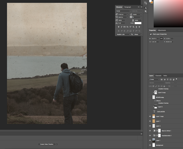
After taking the images I then came to the decision of this one as I think it looked great. I made the photoshop canvass size to a typical film poster of 27'' x 47''. I then dragged the image and sized it to the position I wanted it to be. I felt like that the image was too bright. Therefore, I used the 'Hue and Saturation' effect and made the image darker. Moreover, I still felt like the image was too bright and colourful, so I added the 'Black and White' effect and made it black and white but lowered the opacity on it so it wasn't completely black and white but still made it darker.
 I then added some dirt particles to the layer and lowered the opacity on this, to make the poster look old and an abandoned feel towards it. Following this I also added an old piece of paper texture which I got off google. This made it look great and I love the outcome of it.
Then, I added the text, which was the typeface 'Porter' from my font post. I felt like the text was great as it stands out a lot but needed some character. Therefore, I googled a paint brush texture and placed it above. Then I made this layer have a clipping mask, which adds this layer within the text. I lowered the opacity and increased the levels to make it seem like it had more particles. I think the outcome was great shown below.

I did the same effect with the cast below. I used the 'Will&Grace' font for this. It looks great and really professional. These were all the people involved within my short film.
This is what the final product looks like. I added the billing block at the bottom which I got off google. Then above I added 'coming soon' and 'In 3D', using the same font as the title, to keep it simple. For these texts I used another style to make them look old. I used the 'distorted' effect and made it look like it had particles.
I really like what my film poster turned out like. It has a very old feel about it which is what I was hoping. I think it fits the genre well and the plot. Also from doing research, I followed many of the same traits than other film posters within the post-apocalyptic genre. Knowing this, I know the audience of this genre will acknowledge my poster and it should appeal to them.


No comments:
Post a Comment