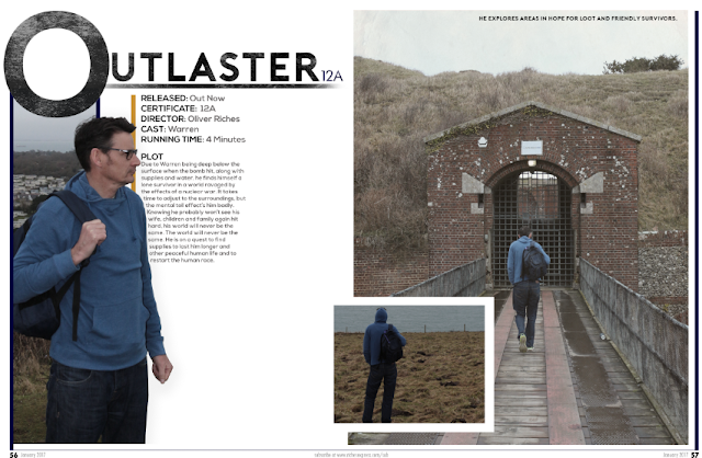
I began to take the image which I took and made it large enough so it fills one whole side of the double page. I gave it a border so the page number and dates can be placed under the photo, then evenly did it the same length round so it looks neat. Lastly, I made a gap for a secondary image so it can be placed there. This will have a white border also like the main image, to stay with the theme and so you can easily see that they are two separate images.
I then placed the other images on. I sized the small image to go in the gap on the large image. Then got another image and put it on the left side of the review page. Rather than just having a normal image I decided on cutting round the protagonist to make it look more interesting and then the text could go around him. I made the images look more old fashioned to go with my film poster theme so I added a black and white effect and lowered the opacity so there is still color on the images slightly. I then added a caption so the audience can understand what he is doing in the images. I used the same font throughout, which was 'Nexa Bold'. This was in my post of finding the correct type faces for my film poster, as I want the same fonts I did not make another post as I wanted to use these fonts still. I made the 'O' larger so the title has some character towards it and this stopped the image upwards which I think looks great. Then I made the rest of Outlaster in smaller text and added the certificate rating next to it in a font called 'Futurist', also on my font post. I made a line to go beneath the title so it makes it stand out compared to any other text. As shown on the screen shot, I used a motion blur for the line which gave it the fading look on each side which I love. Moreover, I used the same effect as the title on my film poster, this was adding a old paper texture to the font and lowering it so it makes the font look great and old.

Then I outlined the left hand image with a blue line which looks great. I added the same line the other side which connects to a thin line at the bottom. Then I added in the page number, website link and date. Moreover, I began to start with the textual features. This was adding the film information and the plot. I used again 'Nexa Bold' for these.
I was close to finishing my review page. I added the rest of the text into columns of my actual film review. It was very time consuming having images that do not have a straight edge so the text had to go around - which I did manually. However I managed in the end and it came out great. I added a black background to the quote which stands out extremely well on the white background and splits up the text well. I then began to add the verdict which fits perfectly in my position that was on my flat plan. In all I am very satisfied with how it looks and I think it looks extremely professional.


No comments:
Post a Comment