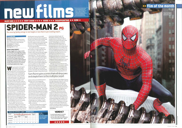
The main image for this takes up just over half the magazine review page, which is slightly more than what the normal size. The image stands out extremely well however, showing the protagonist. His vibrant red colours catches your eye almost immediately when looking at the page. Moreover, the image looks like an action shot due to his body structure and the top and bottom is covered by some creature so it makes us think he is in danger and is very engaging to know more. The title is black and very thick so it stands out exceedingly well on the white background. Just above is a red strip with many one worded reviews and star ratings. There is some great reviews such as 'Must-see' with a 5 star rating however they have also been honest and put a review saying 'Disappointing' with 2 stars. The audience will like this as they are being truthful - not all people like it. Underneath the title is a little plot with a pun to engage the younger audience. It grabs your attention to read on wards for the review. Furthermore, there is a bold sub title stating 'What's the story' which is a more in depth plot of the film. They have made sure you can see the verdict, covering it with a box and a red strip with the stars on. The verdict overall star rating was 5 stars so they have promoted this to make sure the audience are aware. They started the film review with a well known quote from the film, Spider-Man fans will see this and will appreciate it. They have used terms used with the younger generation such as 'Epic cinematography'. They kept the writing very unsophisticated so it is more relate able for the younger generation - who is most likely to read this review page. Moreover, they used a great sub title saying 'Scenes that will drop jaws and staple them to the multiplex carpet'. This suggests that the scenes will be so surprising and overwhelming your jaw the stay to the ground. It is a very descriptive and effective title that Is great. I need to use a sub title like this to intrigue the viewer. I really like the layout of this film review as I think it looks very professional and is divided well so it does not look overwhelming with text. The ratings and titles are clear and bold which makes it easy for the reader to comprehend. If anything this is the sort of review page that I hope mine will come out like.
No comments:
Post a Comment